Ardenclay
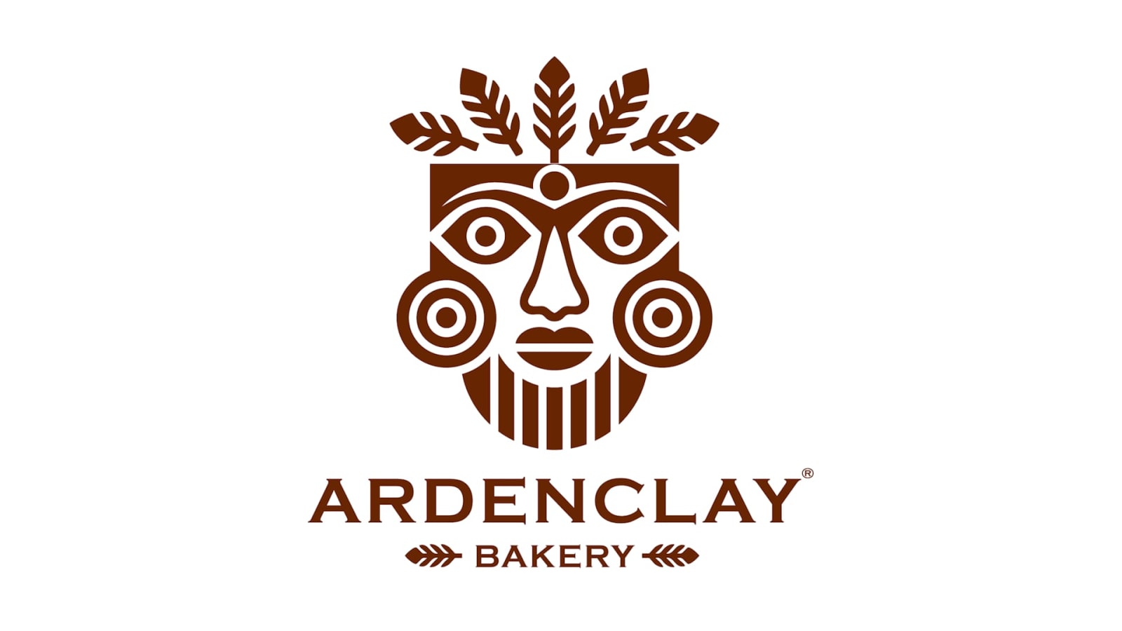
ARDENCLAY is our own bakery-café brand, built as if it were opening tomorrow: a name, a mask emblem with a story, a palette taken from crust and flour, packaging, a shopfront, a kiosk and a delivery livery.
- Client
- Own brand, in development
- Type
- Personal Case Study
- Year
- 2020
- Our role
- Brand, end to end
- Services

01
Ground and fire
Arden for ardent and woodland, clay for the earth the grain grows in and the oven is built from. The name sounds like a place on a map you have never been to and feel you should have.
02
The Elder
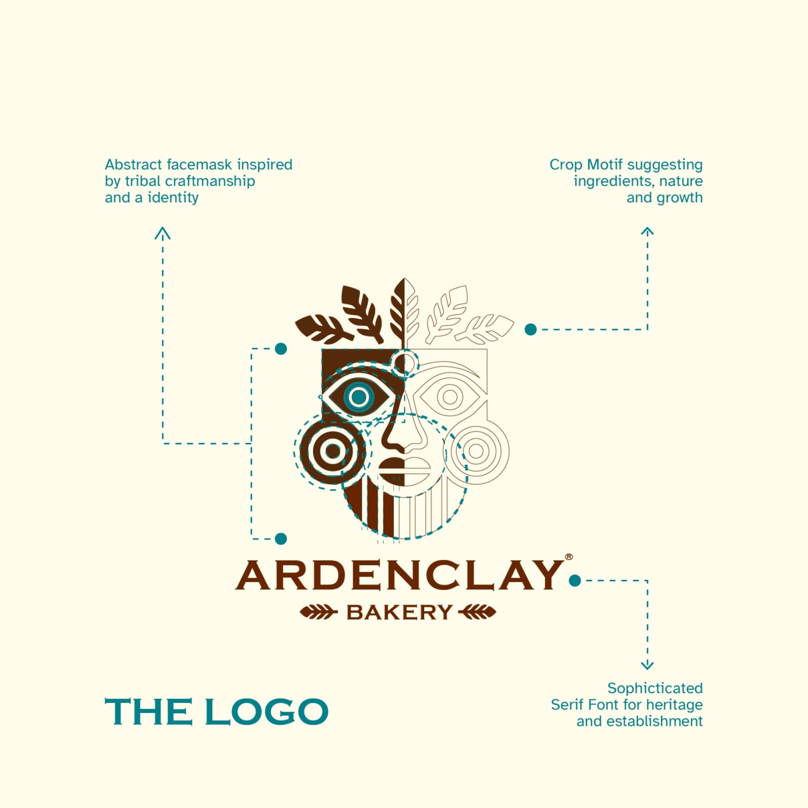
The emblem is a face, the oldest brand there is: recognised in a fraction of a second, readable at any size. One half is solid, the other only drawn, because a loaf is two things at once, what was grown and what was made. A crown of leaves makes it a harvest mask rather than a warrior's, and a single teal eye, the only cool colour in the house, watches the proof and the door.
The mask is invented. It is inspired by the long tradition of carved stone heads, not copied from any object or culture.

03
The system
Five colours: Ardenclay Brown for crust, Fresh Sprout terracotta for clay, Rich Roast teal for the eye, Mellow Mustard for crumb and Warm Oat for flour. A serif wordmark gives heritage at awning distance; a repeating mask pattern becomes tissue, bags and walls.


04
The house
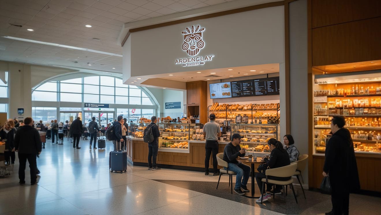
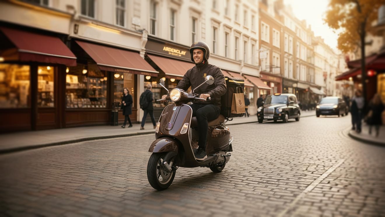
We designed the brand into every place it would meet people: a heritage shopfront with maroon awnings, the counter, an illuminated airport kiosk that has to say "real bakery" in one glance, a delivery scooter, and kraft bags and labels. The scenes are concept visualisations.




05
Voice
Warm, unhurried, a little ceremonial. Short sentences, plain words: crust, crumb, proof, grain. Never "artisan" as a slogan.
- Proofed slowly. Sold fresh.
- Bread with a face.
- Keep the oven lit.